What a mood tracker with analytics should actually help you understand
Good mood analytics do not tell you who you are. They help you ask better questions about your recent days.
Quick answer
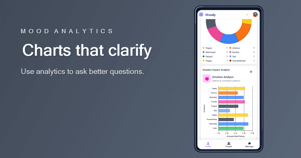
People looking for a mood tracker with analytics want charts that help them understand patterns without pretending to be clinical analysis.
Analytics should clarify, not overwhelm
Charts can make mood tracking more useful, but only when they answer questions a person actually has. Am I having more low days than usual? Did this month feel steadier than last month? Are certain contexts often near better or worse entries?
A mood analytics screen should reduce confusion. If it adds too many chart types, unexplained numbers, or strong conclusions, it can make the history feel more scientific than it really is.
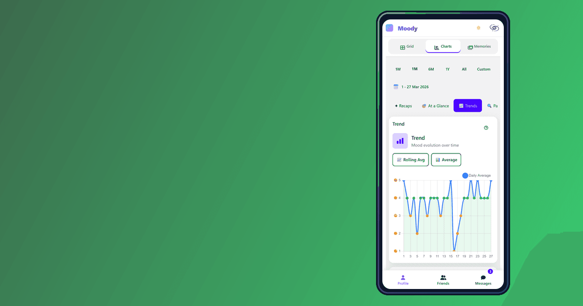
- Trends show direction.
- Averages summarize a period.
- Context helps explain what the numbers cannot.
The best chart starts with a specific question
Before reading a chart, choose the question. For example: how did this week compare with last week? Did my mood recover after a difficult period? Are low days clustered around specific routines? This prevents random chart reading.
The answer may still be uncertain. That is normal. Mood data is affected by memory, timing, missing entries, and personal interpretation. Analytics are a lens, not a verdict.
Context matters more than isolated scores
A single low score does not explain itself. Analytics become more useful when they are connected to context: sleep, stress, photos, notes, activities, weather, or social time. The combination helps you understand what was happening around the mood, not just the mood level.
This is why the strongest mood trackers keep entries and charts close together. If the chart raises a question, you should be able to go back to the days behind it.
Avoid false precision
Mood is real, but mood scores are approximate. A 3 and a 4 may not mean exactly the same thing every day. Averages and percentages are helpful summaries, but they should not be treated like lab results.
Use analytics to notice patterns worth exploring. Do not use them to diagnose yourself or make high-stakes decisions without appropriate support.
FAQ
Start a clearer mood history
Moody keeps analytics readable so charts support reflection instead of replacing it.
Read other articles
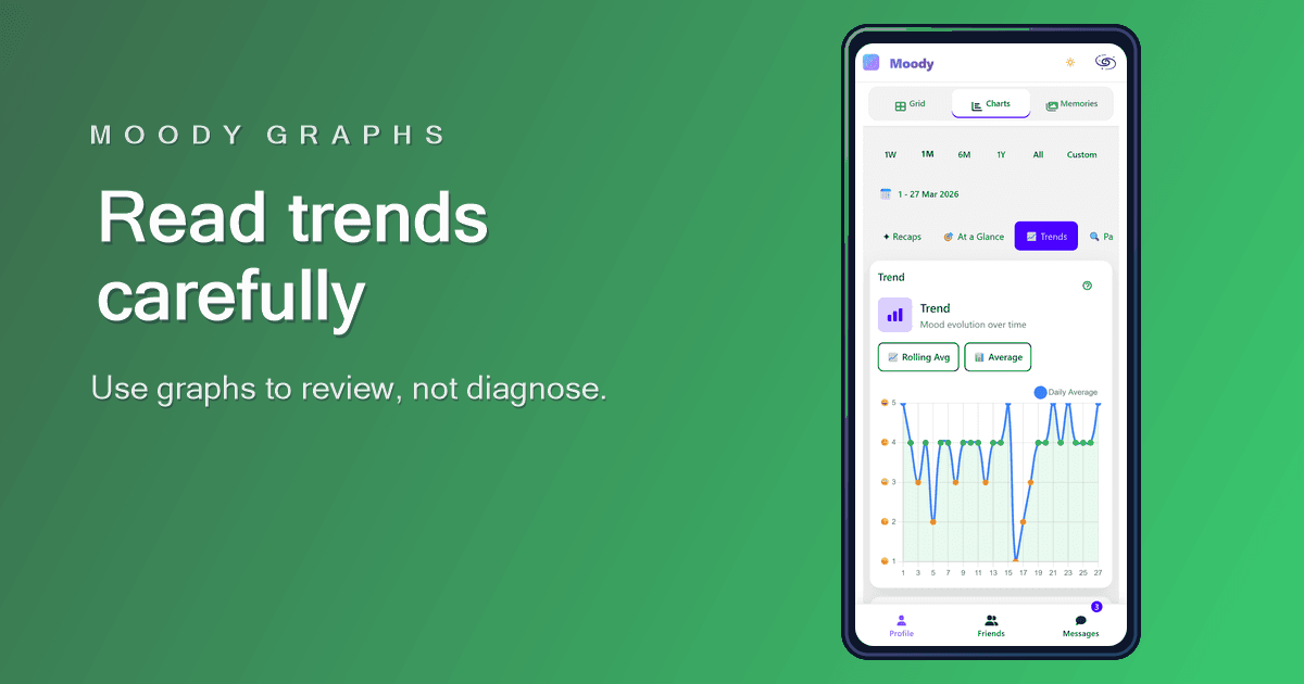
How to use the Moody graphs without overreading your data
Moody graphs are designed to make your history easier to review, not to turn your mood into a scorecard.
Read article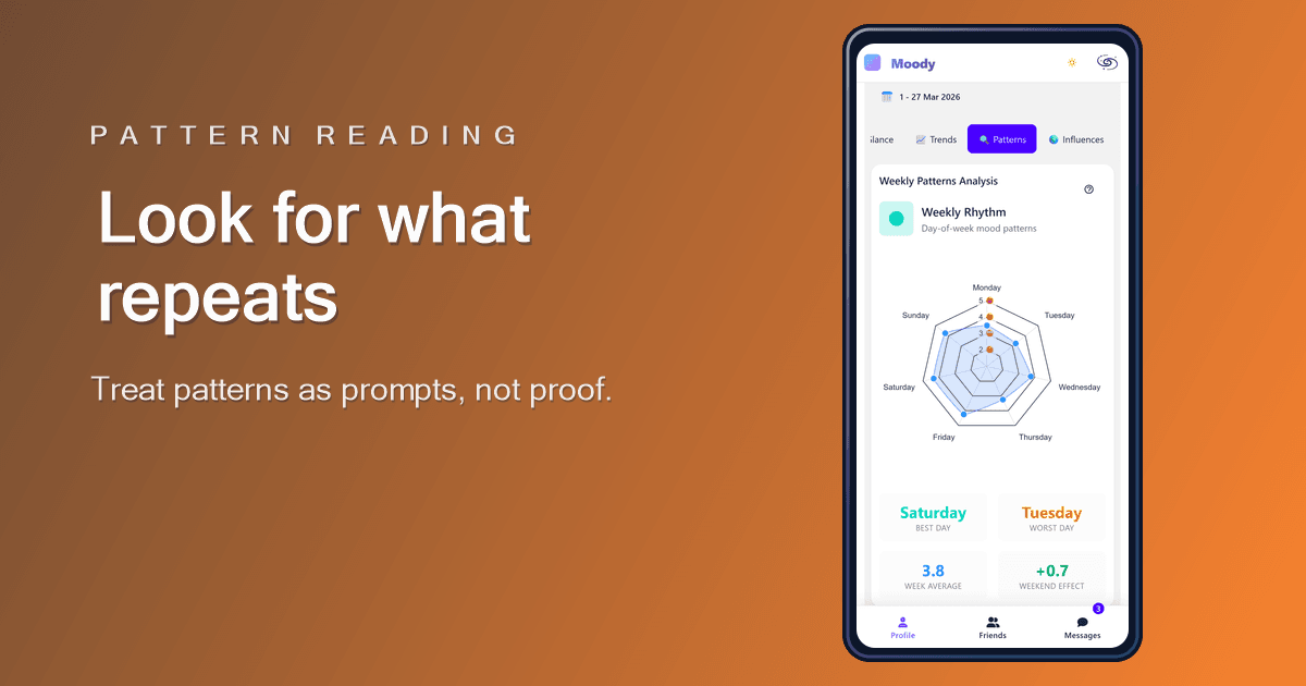
How to spot patterns in your mood data without forcing them
A real pattern repeats. A single memorable day is just a day until the history gives it context.
Read article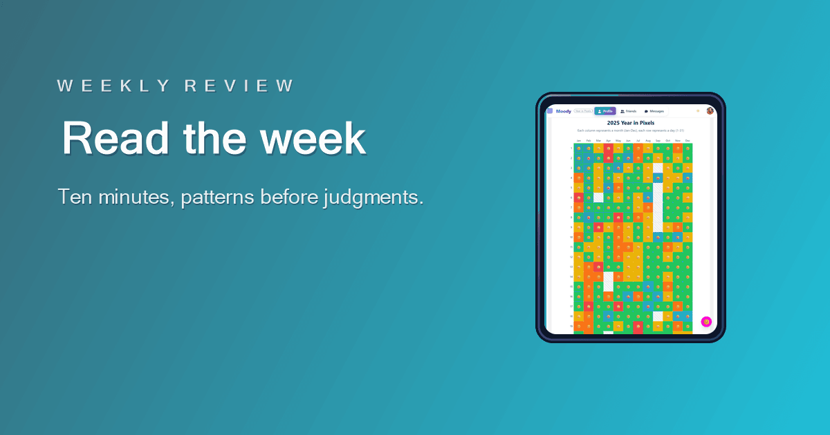
How to review your week with a mood tracker in 10 minutes
A weekly review should help you understand the shape of the week, not turn your mood history into a performance report.
Read article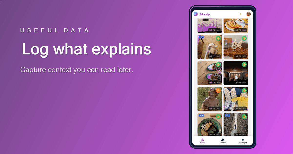
What to log in a mood tracker so the data becomes useful
The best mood tracker data is not the most detailed data. It is the data you can understand when you review it later.
Read article